Typography - Task 3 (a)
4/5/2021- 11/5/2021 (Week 7 - Week 10)
Maizatul Amirah Mahat (0336918)
BA Mass Communication (Digital Media Production) (Minor) /Taylor's University
Task 3 (a)
LECTURES
Fig 1.0: Deconstruction of the letter 'r' [11/05/2021]
The settings and guidelines;
According to Mr Vinod, he stared with the x height, X-height must be 500 points (make a shape 500 × 500 pt). Then, font design adheres to the fundamentals of typography;
- Ascender height; must be within the 1000 × 1000 pt artboard
- Capital height
- Mean/median line Baseline
- Descender height; must be within the 1000 × 1000 pt artboard
Adobe Illustrator settings:
Artboard: 1000 × 1000 points
CMYK
CMYK
Notes:
If the x-height of the design reaches 500 pt, it must be modified. Same goest with the Asceder and Descender heights.
Overshoot happens due to Optical/technical reasons.
How to decide counter space: Same amount of space (thickness) between the 2 stems/half the size of a stem.
Pathfinder will be used to connect basic forms.
Overshoot happens due to Optical/technical reasons.
How to decide counter space: Same amount of space (thickness) between the 2 stems/half the size of a stem.
Pathfinder will be used to connect basic forms.
INSTRUCTIONS
Fig 2.0: Module Briefing Week 1 [30/03/2021]
https://drive.google.com/file/d/1A4mZ4X0s0JSTPCdCounIeiz6kcLaWkU8/view
Task 3 (a) : Typeface Design.
Week 7
In this week, I have started my research on certain typography style that could inspire me to create a new typeface. These are few research and inspiration that I've done:
1. Research on type design.
Fig 3.0: Font & Typeface Inspiration [19/05/2021]
I have chosen to do more depth research on Futura typeface as it peek my interest to use this font often. Futura is a popular and enduring typeface. The form of Futura follows a simple geometry squares, triangles and circles and Bauhaus inspired typeface. The geometric simplicity of Futura hides the fact that every letter has been carefully crafted for optimal legibility and precision. Futura was created by Paul Renner who was born in Germany, died in 1956. He studied painting and architecture in Berlin.
Fig 3.1: research phase [19/05/2021]
Futura forms has sharp joint, geometrical as well with perfect circle 'O' shape. other than that Futura uses diagonal lines and have their own personal characteristic. There's a fun fact shared; Futura is the first typeface on the moon. There are some inspiration that I gain from the characteristic of Futura which are the sharp joints and diagonal lines.
Week 8
In this week, I do sketches to layout some ideas that I could possibly use for this task. My choice of reference to start design my own font was Futura and Univers LT Std and few random design.
2. Sketches.
Fig 3.2: rough sketches [19/05/2021]
In this week, I have chosen which sketch that I would use to go further for my next step which is the 'cta' style.
3. Identify and Deconstructing the reference.
Fig 3.4: Identifying reference
Univers LT Std ultra Condensed is my preferred reference among the ten typefaces. I decided to deconstruct the letters a, m, and t.
Fig. 3.7 Deconstructed 't' - Univers Ultra Condensed reference, [20/5/2021]
In this week, I will focus on digitalizing my chosen sketch.
4. Digitalize final font design.
Fig 3.8 Setting up the guides and measurements [25/5/2021]
This phase was mainly about exploring the implementation of the idea and conceiving several options suitable for presenting the typeface.
In the end, I have chosen Option 1, which suits better for the typeface because it enhance more between the other.
5. Developing the final font in FontLab 7
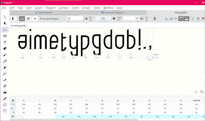
Mr. Vinod's tutorial video on how to build and export our font in FontLab7 was helpful once I had finished my final font design. After putting all of the letters into FontLab7, I used the metrics tab to do individual kerning for each glyph, as shown in the sample video. In the 'font info' tab, I also filled in the font information and dimensions (ascender, descender height, etc.).
Mr. Vinod's tutorial video on how to build and export our font in FontLab7 was helpful once I had finished my final font design. After putting all of the letters into FontLab7, I used the metrics tab to do individual kerning for each glyph, as shown in the sample video. In the 'font info' tab, I also filled in the font information and dimensions (ascender, descender height, etc.).
Fig. 5 Kerning the letters in FontLab 7 [29/5/2021]
6. Final outcome font design.
Fig. 6 Final Task 3A_Type Design and Communication "Thin Vessel" - PDF, Week 9 [1/6/2020]
Fig. 6.1 Final Task 3A_Type Design and Communication "Thin Vessel" - PDF, Week 9 [1/6/2020]
FEEDBACK
Week 8
General Feedback: In this week, due to Raya there is know feedback
Week 9
General Feedback: In week 9, Mr Vinod share his feedback on the structure of my typeface. He mentioned to make sure the structure of the font design are all well balance.
Specific Feedback: Mr Vinod showed me a tutorial on how to design my phone so I need to re-do it using shapes and strokes.
Week 10
General Feedback: In this week, Mr Vinod commend on my final design, there are few minor fix on the final.
Specific Feedback: Shorten the length of the 't', and the tail of letter 'g', 'y', 'e'
REFLECTION
Experience and Finding: Throughout the weeks, I found that creating font is not easy. It takes a lot of trials and error to achieve a good typefaces. This experience has thought me a lot different background of typeface design and at the same time gain a lot of knowledge from my lecturer to further improve my font design (Task 3a)
Observation: I have observe that I have learn alot and I actually have created my own font which can be improve further thanks to Mr Vinod and Mr Sam.
FURTHER READING
In this book/website (http://thinkingwithtype.com/), Ellen Lupton gives specific instructions for aligning, spacing, ordering, and shaping letters, sentences, and paragraphs. From fonts and font families to kerning and tracking to grid use, the book covers all you need to know about typography. Visual examples demonstrate how to be creative within typographic form systems, including how to defy the restrictions and what they are.


Comments
Post a Comment