DESIGN PRINCIPLES [EXERCISE]

4/1/22 Week 01
Maizatul Amirah Mahat (0336918)
BA Mass Communication (Digital Media Production) /Taylor's University
(Minor)


(Minor)
Design Principles / Exercise 1 (30%)
LECTURES
Week 1
In this week, Dr. Charles - brief the class about the semester and session through out the MIB.
Design is practical where you need to master a visual language - Wucius Wong
We as a human we made natural observation.
The Mind is a pattern making system. Our mind communicates with the environment to create all the possibilities and the ability to create patterns, store them, and recognize them. - Edward De Bono.
Each design theorist may have a completely different set of discoveries. - Wucius Wong.
Design Principle is all about visual placement and arrangement.
Visuals are what the eye sees.
Topic 1.1 Introduction to Elements and Principles of Design
Element of designs
• Point;
simplest element of design. used as repetitive mark forms a line. As the point moves in space, other two- and three-dimensional figures and forms are created.
• Line;
A line can be active or static, aggressive or passive, sensual or mechanic. It can also indicate directions, define boundaries of shapes and spaces, imply volumes or solid masses, and suggest motion or emotion. In addition, line can be grouped to depict qualities of light and shadow and to form patterns and textures.
• Shape;
The expanse within the outline of a two-dimensional area or within a three-dimensional object.
Refers to the expanse and area within the outline of a 2D area of within a 3D object. Becomes visible when a line or lines enclose an area or when an apparent change in value (lightness/darkness), color or texture sets an area apart from its surrounding.
- Two general categories of shapes: geometric and organic
- Geometric – circles, squares, triangles, etc. – tend to be precise and regular.
- Organic - leaf, silhouette human figure, etc. – more natural and freeform shape.
• Form;
A 2D region is referred to as a shape, but a 3D area is referred to as a form. In sculpture and architecture, form is frequently emphasized. Yet, we can observe a form in two-dimensional media such as painting, illustration, or drawing, which is typically heightened in tone, texture, and color.
• Texture;
The tactile qualities of surfaces or the visual representation of such qualities, such as rough, smooth, spiky, soft, hard, shiny, and so on, are referred to as texture. It can be explicit or oblique. The two types of texture are actual texture (touchable) and simulated or implied texture (created to mimic the real texture)
• Space;
An indefinable distance between, around, or inside objects is referred to as space. When we are in three-dimensional space, we are aware of our own locations in respect to other individuals, objects, surfaces, and voids at varying distances from ourselves.
- From the outside, we experience mass. From the inside, we experience volume
- In graphic design, space or depth, refers to the area that a shape or form occupies. Space can be defined as positive (filled space) or negative (empty space)
- The illusion of a 3D space can be suggested through depth
- This can be achieved by overlapping images, the variation of sizes, placement and perspective.
• Color;
Color is the visible result of the spectrum of light when it passes through a transparent material or is absorbed and reflected off a surface. In color, light is extremely important.
Color incorporates three variables to create millions of different colors human beings can distinguish, such as:
- HUE, the colors of the spectrum, e.g. yellow and green.
Analogous Color - 2 to 4 colors that are next to each other on the color wheel - warm feeling or cold feeling.
Complementary Color - Color that are across from each other on the color wheel .
Monochromatic Color - Value range by adding white or black into the color to make it variety of mid tones throughout.
- VALUE, the lightness or darkness from white through greys to black. Black and white pigments can be important ingredients in changing color values. White added to a hue produces a tint, grey added to a hue would result in a tone, while adding black to a hue produces a shade of that hue.
- INTENSITY (SATURATION), the purity of a hue. With pigment (black, white or grey) of another hue is added to a pure hue, its intensity diminishes and is dulled.
Principles of designs.
element in composing or creating design. arranging the design in a way to create a composition for your art work. below are the key component :-
1. Contrast
2. Balance - symmetrical and asymmetrical
3. Emphasis - using a focal point to draw people's attention
4. Rules of Third
5. Repetition/Pattern/Rhythm
6. Movement
7. Hierarchy
8. Alignment
9. Harmony
10. Unity
11. Proportion - scale to show level of important
Topic 1.2: Contrast & Gestalt Theory
• Contrast;
"difference". The juxtaposition of starkly contrasted components, or disparities between topic elements in an artwork, is known as contrast. Without contrast, the visual experience will be repetitive and meaningless. Contrast establishes intriguing connections between the visual elements. It stresses a point and communicates material in order to capture our attention and make it simpler for us to understand what we're viewing.
• Gestalt Theory;
Gestalt principles or laws are rules that describe how the human eye perceives visual elements. These principles aim to show how complex scenes can be reduced to more simple shapes. It also aims to explain how the eyes perceive the shapes as a single, united form rather than the separate simpler elements involved.
- PRINCIPLE OF SIMILARITY
The human eye tends to perceive similar elements in a design as a complete picture, shape, or group, even if those elements are separated.
- PRINCIPLE OF CONTINUATION
The human eye follows the paths, lines, and curves of a design, and prefers to see a continuous flow of visual elements rather than separated objects.
- PRINCIPLE OF CLOSURE
The human eye prefers to see complete shapes. If the visual elements are not complete, the user can perceive a complete shape by filling in missing visual information.
- PRINCIPLE OF PROXIMITY
The process of ensuring related design elements are placed together. Any unrelated items, should be spaced apart. Close proximity indicates that items are connected or have a relationship to each other and become one visual unit which helps to organize or give structure to a layout.
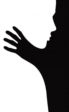
- PRINCIPLE OF FIGURE/GROUND
Objects are instinctively perceived as being either in the foreground or the background. They either stand out prominently in the front (the figure) or recede into the back (the ground).
- LAW OF SYMMETRY AND ORDER
This law states that elements that are symmetrical to each other tend to be perceived as a unified group. Similar to the law of similarity, this rule suggests that objects that are symmetrical with each other will be more likely to be grouped together than objects not symmetrical with each other.
INSTRUCTIONS - EXERCISE 01
[Module Information Booklet]
Produce 1 design based on the principles (2 principles minimum) Any medium (digital or physical) may be used
Progress is to be shown and discussed during live tutorials.
DESIGN 1
Visual Research
I selected to focus on the notion of symmetry for this exercise because I believed it would be the most engaging to try to help people understand the beauty of it.
Idea Exploration
- My concept for this exercise was to illustrate emotions through colors on the face that resembles strength and power over the black and white as the background that resembles insecurities.
- even though there are a lot of different colors, the shapes are all the same and the color is balanced across all sides.
Sketches
- I have come up with a sketch which shows above. This Idea that I have is to illustrate my inner emotions. The color on the face will resembles as my emotions that kept on building up in my heads and this is just part of the idea that came up to me during the sketch stage.
- This second sketch is a progress sketch from the first one. This sketch was to ensure that there's a strong symmetry concept on my design. after figuring all out, I start to do it digitally.
Progress
Feedback
1. So far, its a thumbs up. But needs a bit more balance the white area is to overpowering. Reduce the intensity of the white so it doesn't take too much attention of the face.
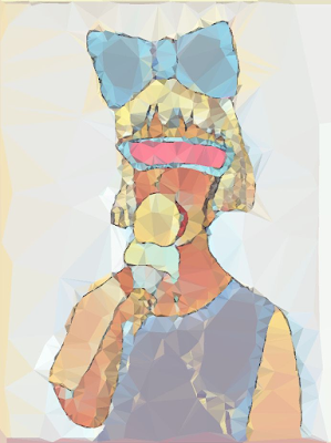
Final Design Outcome
Tittle: Her True Colours.
DESIGN 2
Visual Research
As for my second design, I've chosen to concentrate on harmony and variety. I selected harmony because I want to produce in conformity with my artistic approach. In terms of design, I am someone who goes with the flow. With only a few sources of inspiration and observation of various designs, I believe my creative style is linked to harmony.
Idea Exploration
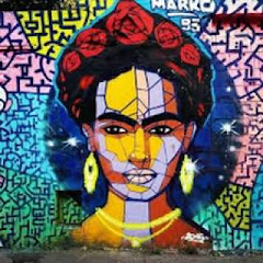
- this reference shows a portrait of a woman starring in sadness. My Idea is to create a portrait of a girl in a middle using pastel color.
- As for this one, using more than one texture appeals to me. It creates an optical illusion for the audience. It provides the observer with numerous perspectives, and I adore the abstract of vivid color and texture.
Sketches
- I've sketched a portrait of a girl eating ice cream. My concept was to make a portrait with modern figurative art. This is an exciting idea, in my opinion.
Progress
- To enhance my portrait, I've used light in the artwork to give a varied gradations that gives luminosity. All that material ultimately contributes to the artwork, even if it's only a few of specks showing through, but it adds texture and everything.
Feedback
The button is a nice touch. But the background is a lil bit empty. In overall its good.
Final Design Outcome
Tittle: Livin Her Life
- The theme is intricate, bright, and diverse. The background, on the other hand, I made it bland, basic, and minimal to let the subject stand out, but I added some yellow color to make it more lively and joyful. In my design, I prefer to utilization of several aspects to generate visual interest. What I've seen about my design is that it encourages viewers to look at every element from top to bottom. It gives them new things to explore each and every details and what attracts them the most.
Reflection
This was a lot of fun since I learned a lot about design concepts and how to use them creatively in my work. I enjoy the principle of 'harmony' because I prefer to create things with distinct identifying traits. I really like creating this since the topic/theme was open-ended, allowing me to draw whatever I wanted and portray it in a way that was consistent with the philosophy. Because it was the first time I attempted something like this, it stimulated and increased my creative thinking process. Furthermore, it had been a long time since I had painted properly, so this was a wonderful opportunity to refresh my abilities. Overall, the exercise was beneficial to me, and I got a great deal of knowledge and experience that I feel I will be able to use to my career in the future.

Comments
Post a Comment