Typography - Task 1


30.03.2021- 28.04.2021 (week 1 - week 5)
4/5/2021- 11/5/2021 (Week 6 - Week 7)
Maizatul Amirah Mahat (0336918)
BA Mass Communication (Digital Media Production) (Minor) /Taylor's University
(Task 1)


LECTURES

Week 1: We have a meet and greet session with the lecturers Mr. Vinod and Mr. Samsul to summarize the first week of lectures. The lecturers are approachable and supportive to the students in the semester. Mr. Vinod began the first class by explaining the module and showing us how to get attendance by replying via Facebook. He also gave a brief explanation and update on a few student blogs. He also states that we students would need to install a few applications in order to complete the exercises assigned by the lecturers.

Lastly, in the second part of the lecture, we were taught in detail on how to use Blogger efficiently with the help of some tips and shortcuts: 

- enter = paragraph space

- shift + enter = force line break

- change coding (br/ to hr/) = creating a horizontal rule

- permalink > incognito web = to make sure all posts/documents are visible

- labeling a picture = label, description, date


Week 2:  Development and Timeline; I covered the progress and timeline of typography lesson for week 2 lecture by watching the recorded lecture posted by Mr. Vinod on YouTube. Typography has a tradition as well, with early letterform evolution ranging from Phoenician to Roman. The evolution of letters from Arabic to Modern Latin forms that can be read originated with the Phoenician alphabet. The Greeks changed the course of history.

1. Early Letterform Development : Phoenican to Roman 
Scratching into wet clay with a sharpened stick or cutting into stone with a chisel were the first methods of writing. Uppercase has been the only letterform for nearly 2000 years. Uppercase: a straightforward arrangement of straight lines and circles.:-


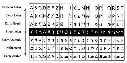
Fig 1.1: Letterform Development (Source: Google) [02/04/2021]


Greek 
  
  • - Move your witing in a different direction (from right to left, to left to right)
  • - Move your witing in a different direction (from right to left, to left to right)
  • - Move your witing in a different direction (from right to left, to left to right)
  • - Produced the Boustrophedon writing style, in which the Greeks did not use letter spacing or punctuation.
  • Boustrophedon: the lines of text alternately read from left to right and right to left.


  • Fig 1.2: Boustrophedon Text (Souce: Google) [02/04/2021]


    Fig 1.3: Greek Text (Source: Google) [02/04/2021]


    Estruscan (and the Roman) 
    Before inscribing the stokes, repaint them with a brush and grow them on marble. A change of weight from vertical to horizontal, as well as a wider stroke.


    Fig 1.4: Timeline of Phoenician to Roman (Source: Google) [02/04/2021]


    Hand Script from 3rd - 10th century C.E.  

    Square Capitals (4th or 5th Century) 
    It can be found in Roman monuments,  Add serifs to the main strokes' ends. The reed pen was held at a 30-degree angle.


    Fig 2.1: Roman Square Capitalis (Source: Google) [02/04/2021]


    Rustic Capitals (Late 3rd - mid 4th)
    Square Capitals in a compressed form, which took a lot less time to compose. The brush or pen was kept at a 60-degree angle. The disadvantage is that it is somewhat more difficult to read.
            

    Fig 2.2: Rustic Capitals (Souce: Google) [02/04/2021]
    Credit: Biblioteca nationale Napoli

    Roman Cursive (4th Century) 
    Documents are written in both Square and Rustic Capitals. It was written by hand in cursive (simplified for speed). As a result, lowercase letterforms began to emerge.

    Fig 2.3 : Old Roman Cursive (Source: Google) [02/04/2021]
    Credit: Biblioteca Medicea Laurenziana, Florence


    Uncials (4th-5th Century)
    A, D, E, H, M, V, and Q were among the things that were incorporated. Uncial is a Latin word that means "twelfth section." Rustic Capitals are less readable at small sizes than Uncials.

    Fig 2.4: Uncials (Source: Pinterest) [02/04/2021]


    Half-Uncials (C.500)
    The formal start of lowercase letterforms. The Phoenician alphabet was created 2000 years ago.


    Fig 2.5: Half-Uncials (Source: Pinterest) [02/04/2021]

        
    Charlemagne (C.925) 
    It was Europe's first unifier after the Romans issued an edict in 789 standardising all ecclesiastical documents. It also developed the calligraphy standard. The monks rewrote the text using the following formula:

                1. Majuscules (uppercase) 

                2. Miniscule
                3. Capitalization
                4. Punctuation


    Fig 2.6: Charlemagne (Source: Google) [02/04/2021]


    Blackletter to Gutenberg's Type 
    For letterform, Gutenberg's mould needed a different brass matrix, or negative impression.
    • Blackletter or Textura became common in Northern Europe.
    • Rotunda gained prominence in South Europe.
    • Based on Alcuin's miniscule, Italy.


    Fig 3: Guttenberg's Type (Source: Pinterest) [02/04/2021]


    Text Type Classification 
    • 1450 Blackletter - The earliest printing type, based on hand-copying styles used in Northern European books.
    • 1475 Oldstyle - Based on the lowercase forms used by Italian humanist scholars in the 14th century.
    • 1500 Italic – Simplified and close-set to allow for more words per page.
    • 1550 Script - Reproduction of etched calligraphic forms.
    • 1750 Transitional - Old-style forms are reintroduced.
    • 1775 Modern - Old-style letterforms are further rationalised.
    • 1825 Square Serif/Slab Serif - Designed for heavy type advertising in commercial printing.
    • Sans Serif - Serif were phased out in 1980.
    Serif/Sans Serif is a 1990 typeface that incorporates both Serif and Sans Serif
    Fig 4.2: Text Type Classification_2 (Source: Pinterest) (02/04/2021)


    Week 3: On this week, we were able to learn on how to create an animated gif for the word expression. There are few samples that have been taught by Mr. Sam. At the same time, Mr. Vinod was sharing some seniors animated gif. Due We also have a feedback session at the end of the class. We were divided into various breakout rooms this week, as is customary, to provide input on our classmates' jobs. The aim, according to Mr. Vinod, is to improve our critical thinking skills and abilities. We were later taught how to use Adobe Illustrator and Photoshop to animate the words. We were also given about an hour to experience and experiment with it so that we could get immediate assistance from our lecturers if we ran into any issues.

    Video Lecture: Basic / Describing Letterforms 

    26 Letters of Typeface:
    • Baseline  -  The imaginary line the visual base of the letterforms
    • Median   -  The imaginary line defining the x-height of letterforms
    • X-height -  The height in any typeface of the lowercase 'x'


    Fig 2.1: Imaginary Line (Source: Google) (09/04/2021)

    • Apex / Vertex - The point created by joining two diagonal stems. 
    • Ascender   -  Extend above the X-height.
    • Descender -  Extend below the baseline.
    • Arm - Short stokes from the letterform's stem, either horizontally (E, F, L) or upwardly (K, Y).
    • Barb -  The half-serif finish on some curved stroke.
    • Beak -  The half-serif finish on some horizontal arms.
    • Bracket - The transition between serif and the stem.
    • Cross Stroke - The horizontal stroke that joins two stems together.
    • Crotch - The interior space where two strokes meet.
    • Descender -  Extend below the baseline.
    • Em /en -  The width of an uppercase M. 
    • Ligarature - Character formed by the combination of two or more letterforms
    • Link - Stroke that connects the bowl and the loop of lowercase G.
    • Loop - Bowl created in the descender of the lowercase G.
    • Serif - The right-angled or oblique foot at the end of the stroke.
    • Shoulder - Curved stroke that is not part of a bowl.
    • Spine - The curved stem of the S
    • Spur -  Extension the articulates the junction of the curved and rectilinear stroke.
    • Stem - The significant vertical or oblique stroke.
    • Stroke - Any line that defines the basic letterform.
    • Stress - Indicated by the thin stroke in round forms.
    • Swash - The flourish expands the letterform's stroke.
    • Tail - The curved diagonal stroke that appears at the end of certain letterforms.
    • Terminal -  A stroke without a serif's self-contained finish.

    Week 4: In week four, we have assigned to watch a long two lecture videos. 

    CTRL + ; (make the margin and column disappear)
    ALT + LEFT ARROW (Kerning)
    Edit preferences - Units Increments - Kerning Tracking - put in number (5)

    Tracking: Kerning and Letterspacing 

    • Kerning - automatic adjustment between letters. 
    • Letter Spacing - to add space between the letters. 
    • Tracking - addition and removal of space in a word or a sentence.
    • Counterform -  the spacing between letters.
    Types of Tracking 


    Text formatting  

    Flush Left; the most natural way of formatting text. Where it alligns from the left side. Each line starts at the same points but ends wherever the last word on the line ends. jagged edge at the end.

    Centred; imposes symmetry upon the text, assigning equal value and weight to both ends of any line. used sparingly for small amounts of copy or text.

    Flush Right; places emphasis on the end of the line as opposed to its start. It can be useful in situations such as Captions where the relationship between text and image might be ambiguous without a strong orientation to the right.

    Justified; imposes a symmetrical shape on text. when dealing with justified text, the spaces in between that form due to justification of the text.

    *Do not use script typefaces in capital letter the way RSVP.


    Typography: Text/Texture
    Understand how different typefaces feel as text, whether it is well formatted or not whether its appropriate or not.

    X-height; area between the baseline and the line above the baseline which called as median line. X-height in contrast with the ascender space and descender space which decides whether the X is bigger.

    Typography: Leading and Line Length

    Goal; easy prolonged reading.

    Type size; text type should be large enough to be read easily at arms length.

    Leading; The  text setting whether its tight or loose to control eye movements.

    *Type face 10 p - leading 12-12.5 (but mostly for san serif like Helvetica use 13)

    Line length; question of the type size and leading. a good rule of thumb is to keep line length between 55-56 character. Extremely long or short lines length impairs reading

    _____________________________________________

    Part 2

    Indicate paragraph
    "pilcrow ¶"used to mark a new paragraph or section of text.

    What is grey value? - grey value is what we call text on a white page. to much kerning can darken the space between each line of text.

    If the leading size is 12 equivalent to the paragraph spacing must also be 12; this is because we want to maintain cross alignment (2 columns of text sitting next to each other where the text line is align to the next column) so we have a good reading rhythm by maintaining cross alignment.

    *TURNING ON HIDDEN CHARACTERS?

    As for paragraph spacing - click the pilcrow symbol the navigate to the exact value for the para spacing.


    Difference between a line space and leading
    leading is a space between two sentences while line spacing takes into consideration of the descender of one sentence to the descender of the other sentence.

    IDENTATION PARAGRAPH

    Ident is the same size of line spacing or the same size of the text.  :-

         lorem ipsum bla bla bla

    lalalalala lalalala lalala alala

    bloop pulp bla blabla.

    "Using indentation is best for Justified alignment" - it helps to avoid the ragging on left or right.

    EXTENDED PARAGRAPGH

    creates unusually wide columns of text.:-

    Lorem ipsum bla bla bla lala la

         lalalalala lalalala lalala alala

         bloop pulp bla blabla.
    ________

    WIDOW and ORPHANS

    "it must never occur in the design"

    Widow - short line left alone at the end of a column of text.

    Orphan - short line of type left alone at the start of new column.

    In justified text both widows and orphan are considered serious gaffes. flush right and ragged left is some what more forgiving towards widow, but inly a bit. Orphans remain unpardonable.

    SHIFT+ENTER helps to bring down the word (rebreak para).
    _______

    HIGHLIGHTING TEXT

    To create different kinds of emphasis require different kinds of contrast by using an Italics information or Bold or Coloured of body text (megenta,etc).

    Quotation Marks  create a clear indent, breaking the left reading axis.
    _______

    HEADLINE WITHIN TEXT

    There are many subdivision within text of a chapters. in the following visuals these have been labeled (A,B and C) according to the level of importance.

    A typographer task is to make sure these heads clearly signify to the reader the relative importance within the text and to their relationship to each other.


    A  head indicates a clear break between the topics within a section. 'A' heads are set larger than the text, in small caps and in bold It shows a clear break from the text which indicating a new body of text with a different headline.

    Fig 2: Headline (Source: Lecturer Slide) [23/04/2021]

    B head here is subordinate to A heads. B heads indicate a ew supporting argument or example for the topic at hand. As such they should not interrupt the text as strongly as A heads do. Here the B heads are shown in small caps, italics, bold serif, and bold san serif. They don't use paragraph space but they're using a force line break (following the leading space).

    Fig 2: Headline (Source: Lecturer Slide) [23/04/2021]

    C heads, highlights specific facets of material within B head text. They not materially interrupt the flow of reading. As with B heads, these C heads are shown in small caps, italics, serif bold and san serif bold. (create M space, or double spacebar between the heading C and the new beginning of the particular paragraph or column)

    Fig 2: Headline (Source: Lecturer Slide) [23/04/2021]
    _______

    CROSS ALIGNMENT

    cross aligning headlines and captions with text type reinforce the architectural sense of the page - the structure - while articulating the complimentary vertical rhythms.

    if the left alignment uses big size of type face, double the leading points.


    INSTRUCTIONS


    Fig 3.0: Module Briefing Week 1 [
    30/03/2021]
    https://drive.google.com/file/d/1A4mZ4X0s0JSTPCdCounIeiz6kcLaWkU8/view


    Task 1: Type expression exercise.

    For my first task, we were given the task of typographically expressing 4 out of 7 of the definitions of the terms using any typeface that was appropriate for the words we were given. We must imagine it and create a template that can effectively communicate the message. The following are the words:

    1.Slice
    2.Wave
    3.Punch
    4.Scream
    5.Spin
    6.Eat
    7.Point

    On out first tutorial and practical session, Mr. Vinod shares some seniors work for us to refer. Before we start the task on Adobe Illustrator CC, I sketched them out on a piece of paper to see which peek into my mind first. Later, I've start to properly sketch out some few ideas and digitalize it. 


    Figure 1.0 Rough sketches [6/4/2021]


    Week 3
    In this week we were pitching our digitalize project progression. 

    Figure 1.1 First Attempt on Digital Illustration [13/4/2021]


    For my first attempt, I was still searching for inspirations or source of ideas. though the climb was not part of the word given (I confused myself with all the words given), it was a step to find and generalize to a better idea. So, I've started with a simple question in mind such as what font I should I use, should I create word repetition, how should I control my design to avoid too much distortion and many mores to think. 


    So I've done a few research on how to encounter Word Typography design and Skills to make the word more lively -

    https://youtu.be/cq3K27M36mI [14/04/2021]

    On this week as well, we were assigned to start creating our own animated GIF. -

    Figure 2.0 Animated Tutorial progression [13/4/2021]

    Figure 2.1 Animated Tutorial progression [13/4/2021]

    Figure 2.2 Animated Tutorial progression [13/4/2021]

    Figure 2.3 Animated Tutorial Final Product [13/4/2021]


    Project Continuation - 
    Following up on my previous editorial, I'm currently fixing and improving the digitized version of the typography sketches based on feedback from lecturers and classmates.


    Figure 3.0 Word Illustration progression [13/4/2021]


    FINAL OUTCOME
    Figure 3.0 Word Illustration final [13/4/2021]


    Task 2 : Text Formatting.
    In week 4 I have assigned to complete all four phases of text formatting. In this particular task, we need to use the Adobe InDesign software. I have never used this software before.  Mr. Vinod and Mr. Shamsul led us through it. They recommended that we watch a pre-recorded lecture video on YouTube.

    The first phase of the lesson required us to design our names using the various typefaces provided. I practiced how to use those letter-by-letter kerning in this section. In addition; change the layout, columns, and margins.

    Figure 4.0 Phase 1 [22/4/2021]

    In this second phase task, I have followed each and every steps to further understand the process.

    Figure 4.1 Phase 2 [22/4/2021]

    In the third phase, I have learned to apply image on the page, fixed the alignment, ragging by using kerning, Paragraph spacing and setting up the points of the texts.
    Figure 4.2 Phase 3 [22/4/2021]

    In the fourth phase, The purpose of showing the baseline grid; to ensure the text you lay-out sits on the baseline grid - helps to achieve cross alignment.

    Setting up the baseline grid - Edit + Preferences + Grids... 

    Text frame option (CTRL+B) = General, Align to top - Baseline Options, Leading
    Figure 4.3 Phase 4 [22/4/2021]

    This is few of my result for my Task 1:


    Figure 4.4 Final Result task 1  [22/4/2021]


    FEEDBACK

    Week 1
    General Feedback: Before uploading images/sketches to the e-portfolio, they must be taken or scanned in fine, natural, even light with no shadows. The images/sketches must be classified as follows: Figure 1: Explanation (date).


    Week 2
    General Feedback: No graphic elements or unnecessary distortion were permitted because they would jeopardize the originality of the typographic expression; however, minor graphical elements are permitted for very limited design. We were given the opportunity to provide input and thoughts on our classmates' designs.

    Classmates Feedback: During the breakout feedback session with Siti Maisarah and Xin Thien Soo, they have given few beneficial comments about my typography design:

    As for the climb; most of the designs were expressed strongly and the third design peek their interest more. They like how the word are align upwards and a figure of a person going up. As for eat:- the ideas that I’ve presented in the sketches were not as strong due to the lack of details so I’ll manage the details. Scream; both of the ideas based on their comments, it presented well with no need improvement. Wave; the first wave idea was simple and clean and illustrated a wave shape.
    Slice; they do like my first idea. No improvement.

    Week 3
    Feedback from Mr. Vinod: From the diagram, he gave me feedback on certain things- 
    - He complimented the Slice and shared that he don't really see why it should've be in grey color. I forgot to mentioned that I took it more into the dark side of 'Slice'.
    - The composition of the word Climb. Stacking the letter upwards is enough and placing the characters in the letter 'M' is already considered as graphics that could over kill the design. 
    - I believe that the idea of scream on my first attempt is really dull. Mr. Vinod told me that it does the job but its ok.
    - the Wave was a little too much distortion.

    Week 4
    Is the animation suitable?
    Does the animation reflect or enhance the meaning of the word?
    Does the animation reflect the form being expressed?
    Does the animation create a smile in your mind?
    How can it be improved?
    Classmates feedback:


    REFLECTION

    Experience: Throughout the weeks, I have experienced a lot of things. I was taught the fundamentals of typography by doing this practise and going through lecture videos. Even there were a few challenges that I need to go through such as  coming up with ideas, scary critiques from the lectures, it was definitely helpful to further improve my skill. I enjoyed my first exercise which was the text expression. As it comes more challenging in the second exercise were we need to understand a lot of things which were Kerning, Paragraph spacing, Alignment, columns, etc.

    Observation: Throughout this exercise, I have observed that there are a lot more ways to make the design good with using text formatting. the technics that have been use can help create depth, contrast, value, hierarchy and forming various scales and shapes.

    Findings: I learned that typography has a lot of laws, which took some time to absorb as well as grasp and recall all of the words. While doing typography, I discovered that we need to prepare ourselves to evaluate every little detail while still solely critiquing our work so that we can develop. I also discovered that basic typefaces (such as Helvetica, Univers, Baskerville, and others) are the product of complex and in-depth design processes. When it comes to designing and organising type, there's a lot to consider.

    FURTHER READING

    No More Rules: Graphic Design And Postmodernism : Graphic Design And Postmodernism
    No More Rules was the first comprehensive critical examination of postmodernism's influence on graphic design in the 1980s and 1990s, a transformative period for the discipline. Now reissued in a modern miniature format, it tells how designers and typographers threw the rule book and forged new approaches to experiments. No more rules give this advice in depth and divide into main trends and themes a vast and often confusing area of graphic design. Each of the major themes of this book; American new wave, punk and the aftermath, deconstructionist theory and design, digital type revolution, grunge, graphical authorship and graphical agitation, is illumined with impressive examples of works that have changed the way designers and their public think about graphic design.

    Comments

    Popular Posts